About to launch your website?
Amazing! There’s nothing quite like the big launch after months of planning, designing, writing copy and building. You may be so consumed by the excitement of finally seeing your vision come to life, that it’s easy to forget a couple of things that add that bow to the nicely wrapped gift.
At Deep Blue Sky, attention to detail is everything. We go through a rigorous checklist after development and before the world gets the full experience. Here are a couple of items that should be on everyone's checklist before the big reveal.

The 404 page
Get creative
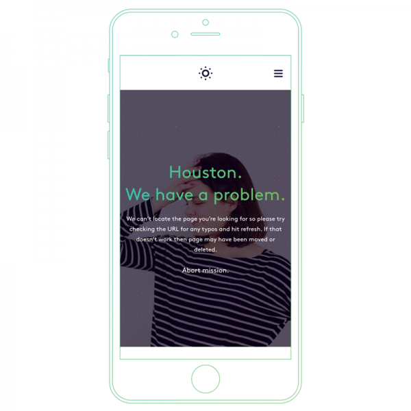
Don’t worry, we’ve all been there. The 404 page is easy to forget. We lose track of time making our pages look great that we often miss the pages that we hope the user will never see, such as what page will display when the user hits a broken link. When this happens, the browser renders a 404 page, indicating that the page cannot be found.
404 pages are great for expressing your tone of voice. Get creative, use humour and keep it on brand. Be sure to include a return link so your users are able to quickly get back to the previous page.

Favicon
Stand out from the crowd
The favicon appears next to the website title in tabs and also prominently displayed when a tab is pinned or bookmarked. They are sometimes overlooked but are a great way to showcase your brand mark, even when the user is not on your website.
- Design your favicon in a 32px by 32px square and export it as a PNG.
- If your logo is white, consider adding a background colour.
- Bold and bright logo? Export with a transparent background.
- Browsers are usually a shade of grey by default, so loading a white favicon without a background colour will yield less than desirable results.
- As a general rule, go for white or a brand colour as the background.

Open Graph Images
Sharing is caring
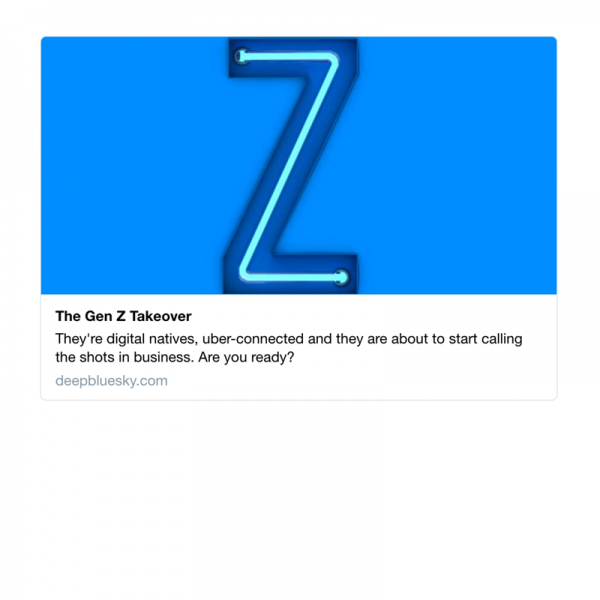
We are always sharing our favourite websites with friends and family or blog posts that are so compelling we want to shout about them on social. Social media sites will automatically generate an Open Graph image by selecting a prominent image on the page you have linked to.
Sometimes this really works. For example, when you share a blog post, it’s likely the perfect image has been used to describe the content.
But, we can also share individual pages within websites. When this is the case, we want to take our Open Graph images a step further and match the outstanding website you’ve spent so much time developing.
You will want to create Open Graph images for each of the main social networks - Facebook, Twitter and LinkedIn is a good place to start. Sprout Social has a great, always up-to-date guide on social media image sizes.

Touch Icons
What are touch icons? On iOS, Android and Windows devices (to name a few), you are able to save your favourite websites direct to your home or start screen. These shortcuts appear in a similar way to downloading an app from the app store.
A touch icon is automatically generated if one can’t be found, but we can once again customise and add value to our website.
Simpli have an excellent post about touch icon sizes (and a little bonus information on favicons).

SEO Friendly Copy
When writing your copy, it’s important to consider what users are searching for in search engines. Robots regularly crawl websites online and analyse the content in order to produce effective search engine results. Be sure to write headlines and copy that are relevant to your market. This will help search engine algorithms better understand the product or service you are providing.
Start by generating a keyword plan to understand what your potential customers are searching and use those keywords when forming your copy. Spamming keywords in your copy won’t work (algorithms are clever enough to spot things like that) and will hinder your ranking. Simply write headlines and copy that is clear, sounds natural and gets to the point.

Cross-browser Testing
Everyone has a favourite browser, but when building a website, we need to consider all users on all browsers. Firefox, Internet Explorer (or Windows Edge as it’s now known), Safari, Opera, the list goes on, not to mention tablets and mobiles. It’s important to get your hands on all these browsers and test in different environments. Surprisingly, results may differ from Chrome on Mac to Chrome on Windows.
Don't worry, you don’t need to run out and buy a stack of equipment to test on. BrowserStack is a great place to start. This service will run your website on different browsers and devices and fire back the view. You can quickly scan to see where major issues are, fix, and run another test. It’s a quick and easy way to get started with your cross-browser testing.
If you’re based on the South West, stop by ODL Bristol. ODL have collected multiple popular devices and gives you the ability to see first hand how your website will look on a real device. Pretty great!

Pixel Perfection
Ready to go live? One final check.
It’s easy for styles to accidentally fall out of place while you are bug fixing. Run through your website and check to make sure you website is pixel perfect. Don’t forget to run a style check on tablet and mobile.
Does the spacing between text and buttons match the designs and are consistent across all pages? Are all images sharp and optimised for speed? Does your copy have any typos? It never hurts to audit your site one last time.
These are some key checklist items to run through before you push your site to live. You should run through these same steps when you update your website or add additional pages, it will save you a headache further down the line and your future self will thank you for it.
If you have any questions, feel free to Tweet Us or drop us an email at hello@deepbluesky.com.
Good luck with the big launch!
Write a comment.